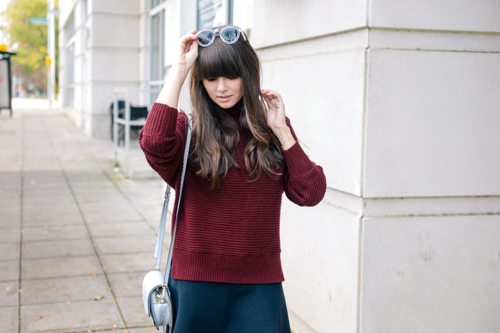
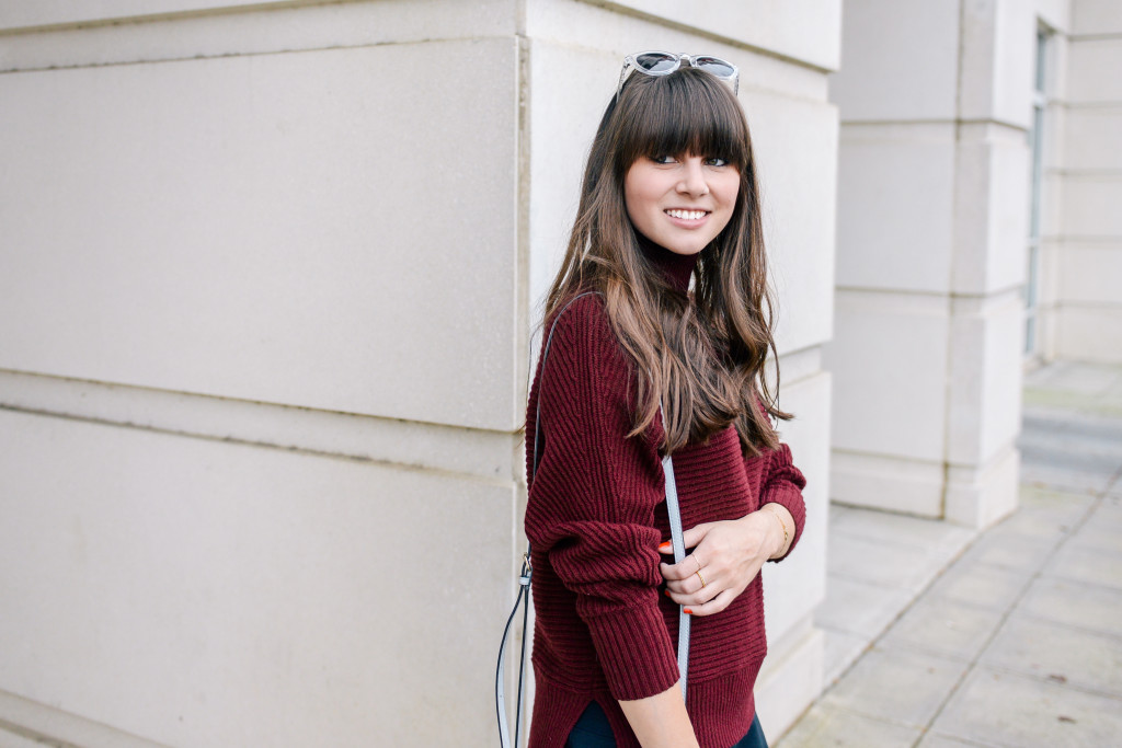
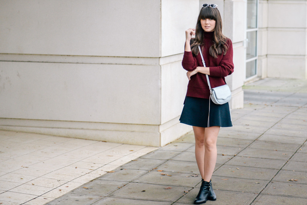
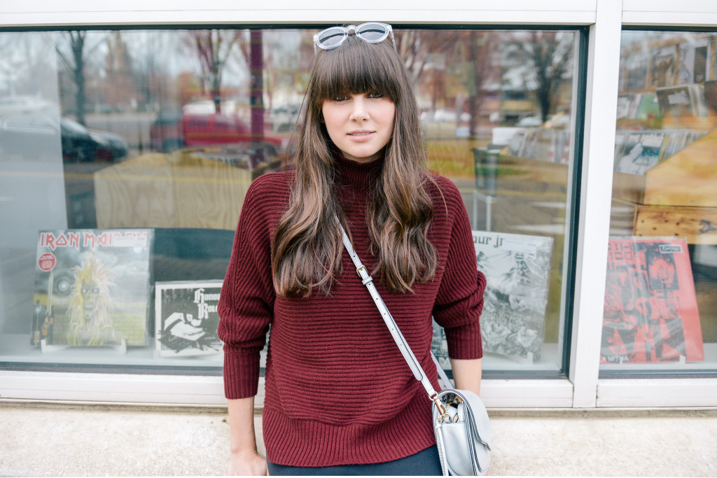
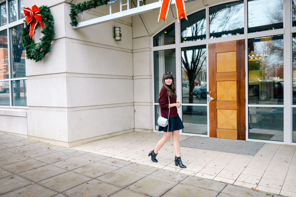
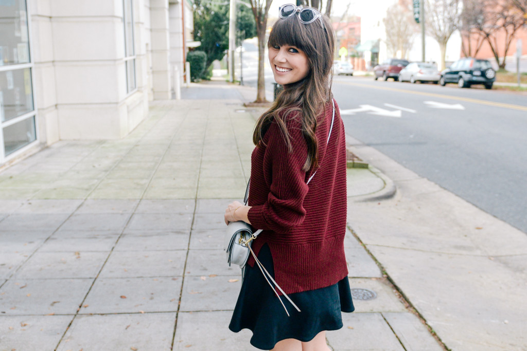
Every year, Pantone releases a color of the year. They claim it will be the hue that will be seen most commonly in both fashion and interior design – or just most poplar in general. For 2015, Pantone’s color of the year was Marsala. It’s this pretty deep red and oxblood color I’m wearing in the sweater above. I remember when Pantone first announced this was the color of the year, I was so excited. I knew that this would be a shade I could easily and confidently incorporate into my existing wardrobe.
Pantone recently made their shocking announcement for the colors of the year for 2016. Yes, you read right – colors, plural. For the first time ever, Pantone has selected two colors as their color of the year: Rose Quartz and Serenity. It’s a combination of a light pink and an almost-baby blue; a pastel pair made in heaven.
Not only am I so looking forward to this combination because I fell in love with adding pastels into my wardrobe last summer, but also because it gives me the perfect opportunity to try out some new color combos! Pantone suggests that these two colors, when put together symbol calmness, and that’s definitely something I wouldn’t mind a little more of! Pale shades of pink and blue combined in one look? Yes, please!
Photos by Ryan Sides
SHOP THE POST
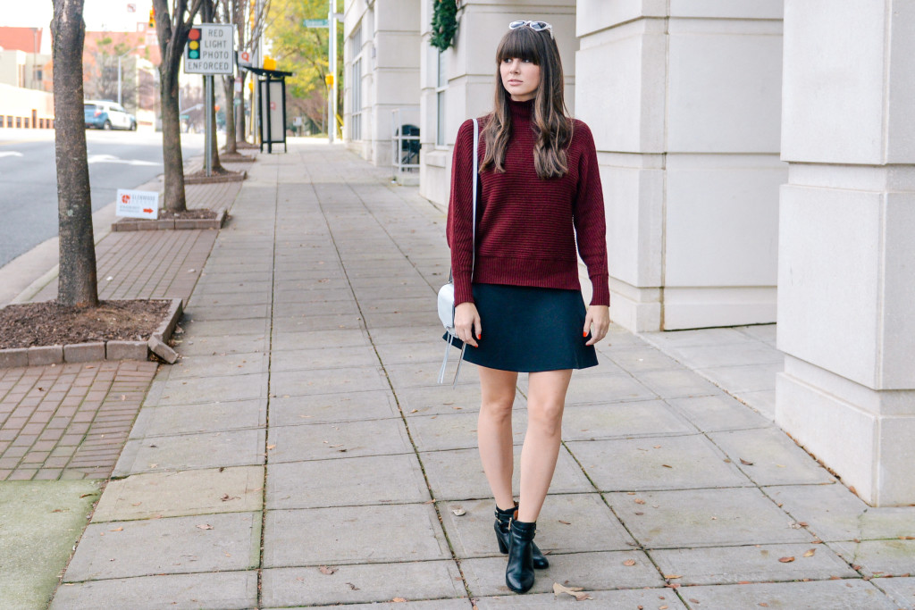
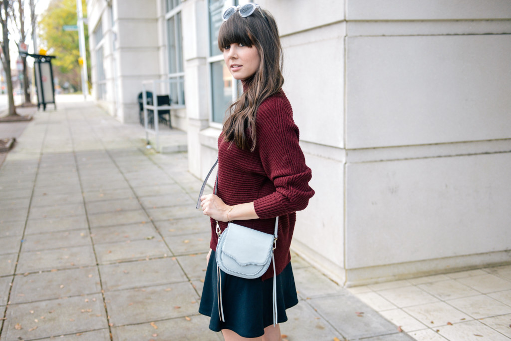
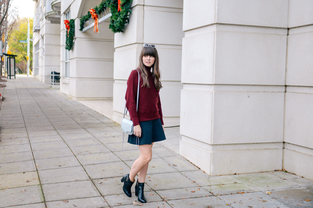
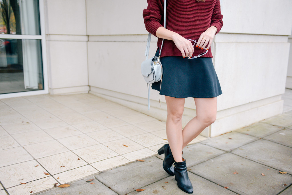
[thefeedproducts style=’four’]LOFT SWEATER :: MADEWELL SKIRT (SIMILAR) :: LOUISE ET CIE BOOTIES :: REBECCA MINKOFF BAG :: CRAP EYEWEAR SUNNIES ::

Really cute outfit <3 I would definitely wear it myself!
Kisses and good karma,
Tatum | AbstractAphrodite